Wine ’n Dine
Product: Wine ’n Dine
My Role: UX Design / UI Design / Interaction Design
Users: Food-loving iPhone users worldwide
Platform: iPhone
Client: Wine ’n Dine
Year: 2016
Link: Apple App Store
Project Overview
Wine ’n Dine is a food-centric social media discovery app that features over 80,000 restaurants around the globe. It empowers users to “generate amazing pictures and help each other find the best food their city has to offer.”
The Wine ’n Dine team reached out to me and said, “restaurant pages are extremely important to our success. And yet, there’s room for improvement … many users are leaving the app for competitive products like Yelp or Foursquare to surface critical information.”
Constraints
My constraints for the project were to only change restaurant pages and reflect those changes in search results, not modify the current design system, only design for iPhone (their only platform at the time), and complete research and design in a 3-week design sprint. I was the only one working on the project after briefing.
Validating the Problem
To learn more about the industry and validate the problem, I dove deep into competitive research by comparing Wine ’n Dine with some of the most well-known apps in restaurant discovery at the time.
I focused especially on Yelp and Foursquare because those were the apps that users were leaving for most, and my feature analysis of the three apps highlighted how Wine ’n Dine’s restaurant pages were incomplete in comparison to its competitors:

I researched the most popular restaurant discovery apps to better understand the competition.
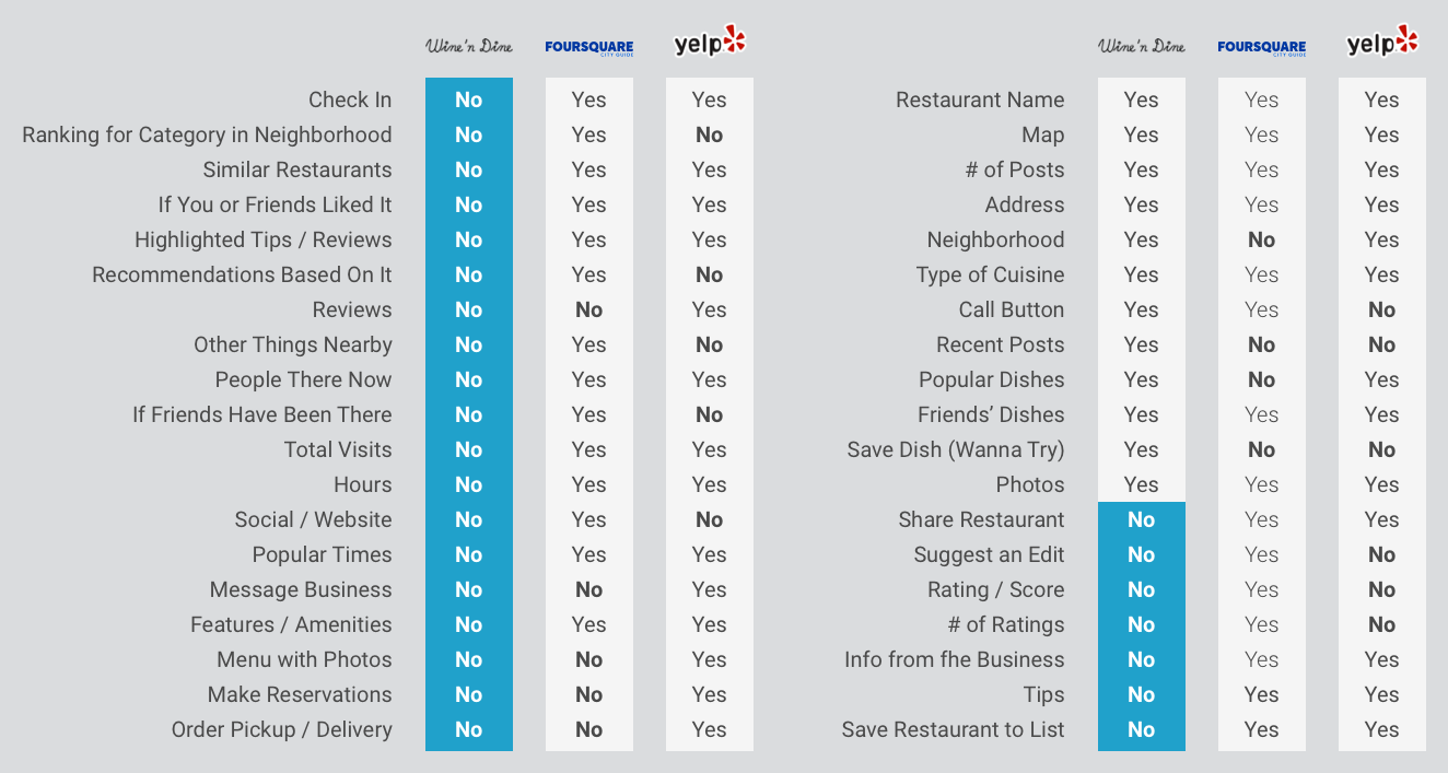
Wine ’n Dine’s restaurant pages were clearly lacking compared to its competitors.
Confirming User Needs
I wanted to confirm that this lack of features was a true unmet need for users, so I organized testing sessions with 8 participants aged 28 to 65. These included home cooks, restaurant-goers, and a professional dinner planner.
Each participant used the Wine ’n Dine app to find and book a restaurant, and they shared their thoughts along the way. To illustrate the experience from a user’s perspective to stakeholders at Wine ’n Dine, I created the following user journey map:
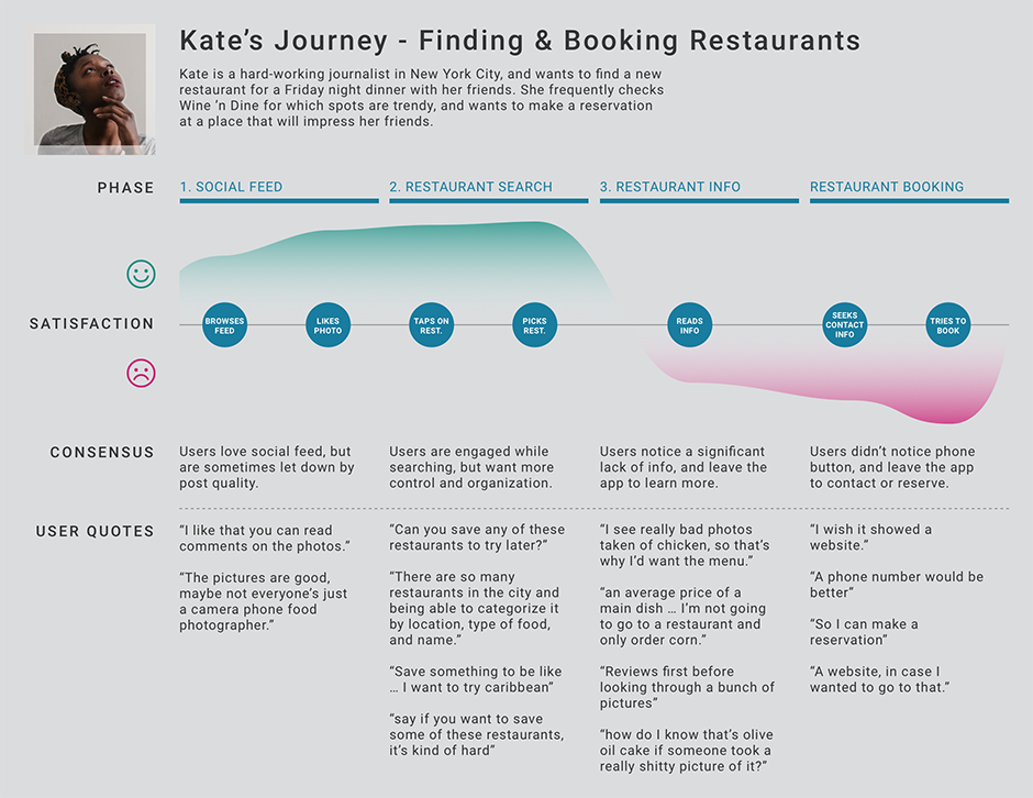
I made this user journey map do demonstrate to stakeholders that social posts got users excited to look at restaurant pages, but users were let down by the lack of information on the restaurant pages.
Need Prioritization
Of all the problems uncovered during testing, I focused on the 6 most commonly reoccurring issues: no menus, bad photos, missing contact information, no prices, saving and categorizing restaurants, and no reviews on the main page.
Armed with my research, I sketched and iterated until I reached a design that best met user needs and Wine ’n Dine’s business goals, which I then translated into digital wireframes for initial testing.
Iterations - Restaurant Pages
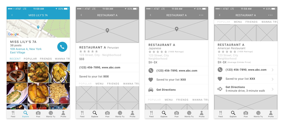
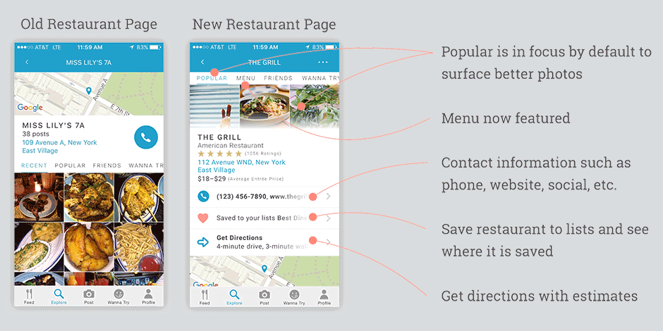
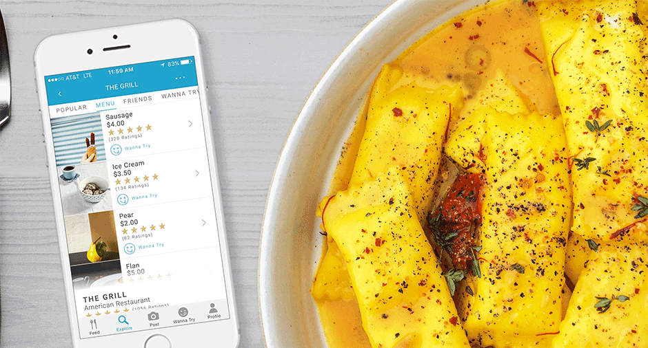
The restaurant page redesign gave users the information they needed, like price ranges, type of cuisine, better contact info, ratings, and more.
My first iteration of the restaurant page had no tappable area for directions as I intended for a directions interaction to be featured in the map after tapping. In testing, users wanted quick access to directions in minimal steps before needing to open the map so I added a directions shortcut with timing estimates. Adding icons for each section also helped testers scan the page more easily to find the information they needed.
Most testers were put off by how the existing app’s featured photos were either unappealing or low quality, which I learned was because the featured photos always came from the recent photos gallery. In my redesign I made the featured photos pull from popular photos instead of recent photos to remedy this.
Fine Tuning - Restaurant Pages
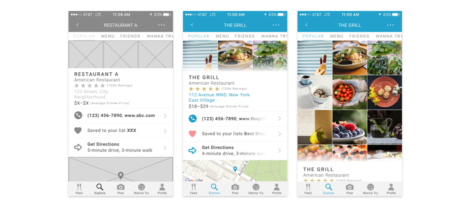
Changing the hard top edge of the information overlay to a gradient motivated users to pull down the overlay to reveal the photo gallery.
Even though the images were partially covered by the information overlay in the iterations above, many users weren’t as motivated to pull down to see the rest of the images. Adding a gradient to the top edge of the overlay motivated testers to pull down and reveal the images in the photo gallery.
The gradient performed well in testing, but if I had more time I would have liked to experiment with alternatives like drag indicators and cards with rounded corners to make the interaction even clearer.
Iterations - Menu Pages
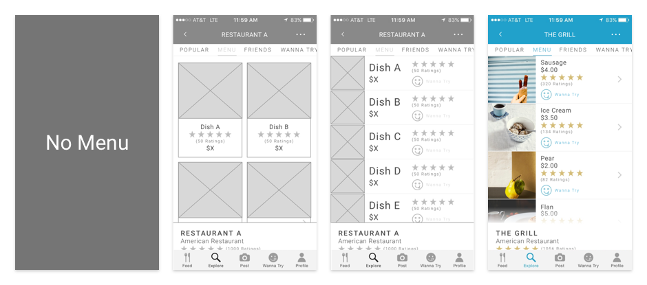
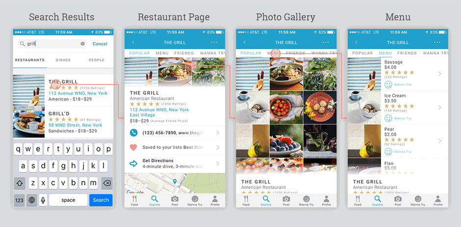
Adding a menu page helped users better understand a restaurant’s offerings. A vertically stacked list format allowed for more visible items and information.
I started with a card format, which testers liked visually but thought it didn’t have enough content visible at one time. Many testers also mentioned they would be most comfortable with a list format because it mimicked most actual restaurant menus and was good for scrolling.
After changing to a list format, testers said the imagery felt too small and was often hard to discern. They also didn’t think to tap on the dishes for a feed of each dish and only browsed visually. I enlarged the images to match the image size in the popular photo gallery so swiping from gallery to menu would be an easy visual transition, and added arrows to the right of each item to communicate their interactivity.
While testing with real restaurant names, it was clear that a side-by-side data arrangement made it impossible to fit longer restaurant names, so I switched the data to be vertically-stacked to allow for more information to be visible without truncation.
Iterations - Search Results
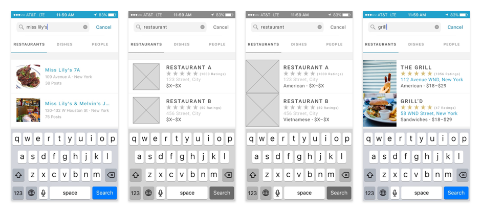
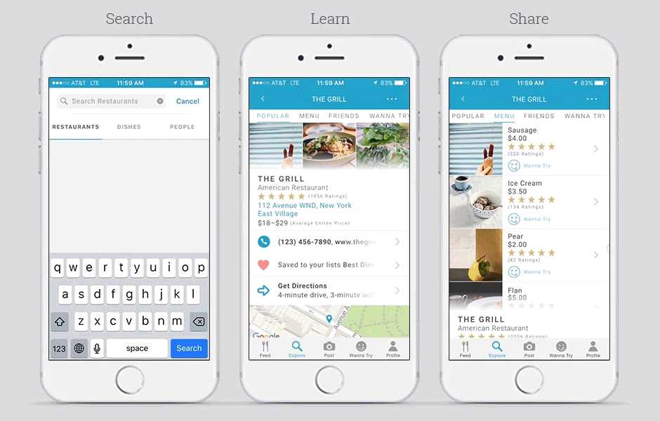
Testers appreciated the redesigned search results with ratings, price ranges, cuisines, and increased image sizes.
One of my constraints was to adhere to the current search results system, so I needed to work within the existing layout. At first I kept image size the same as the existing app, but testers commented that the images felt small for an app that was so photo-centric.
The existing app didn’t list the type of cuisine in the results, and testers said they often couldn’t tell what type of food it was from a photo and name alone. I added the type of cuisine to help with this.
I put the restaurant names in all caps and inverted the color of the restaurant name and address to be consistent with the rest of the app, but if I had the opportunity to redesign the search results system I would have changed all restaurant names to title case to improve accessibility.
Updated Flow
Redesigning the flow and including a menu page allowed for an experience that gave users the information they were missing when they needed it, and encouraged them to stay in the app instead of leaving for other products
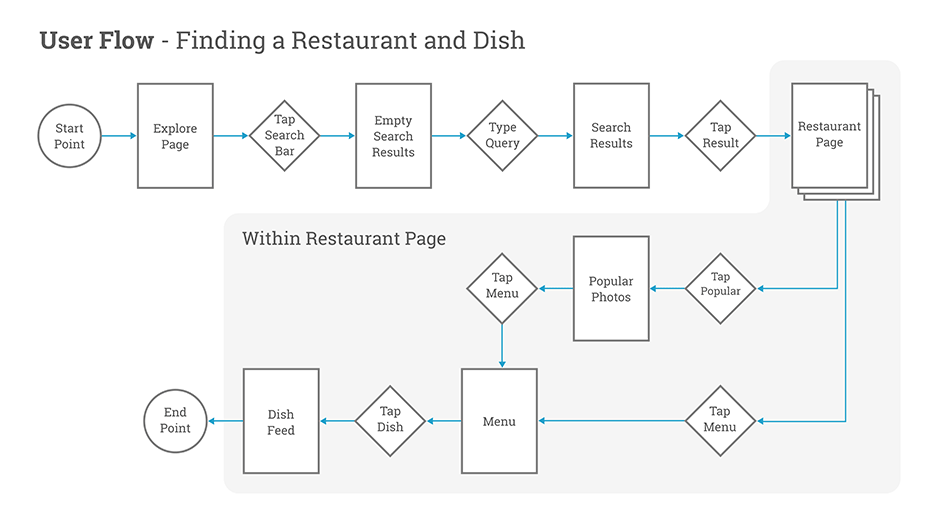
The redesigned flow addresses the unmet user needs from research by allowing users to visit restaurant pages from search results, and then see the information that was previously missing and causing them to leave the app.
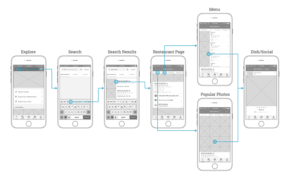
I designed the restaurant pages to have clear and logical ways of navigating between the main restaurant page, menu, popular photos, and dish feed.
Better photos, more detailed contact information, menus, saving to lists, and directions helped users with their unmet needs from the existing app.
Users could now easily access the information they were missing from improved search results and restaurant pages.
Users no longer needed to leave the Wine ’n Dine app to find the restaurant information they wanted.
Motion Design
To further elevate the user experience and make Wine ’n Dine stand out from competitors, I designed animated interactions for restaurant discovery. I repeatedly tested with users to ensure the interactions felt natural, delightful, and visually-polished while effectively communicating relationships between elements. If I had the chance to go back now, I would reduce the springiness of some of the animations.
Careful attention to motion design made interactions and screen changes feel natural.
Closing Thoughts
Unmet needs arose in testing for users to be able to save restaurants to lists directly from results, but one of my constraints was to not add extra functionality to the search results screen. Testers also wanted to view search results on a map to better understand location details, but this was out of scope as well. I would have loved to explore both possibilities in a future iteration.
I would have also liked to do a deep explore on better ways to communicate ratings than stars. Testers were hesitant to give restaurants ratings below five stars out of fear that the lower ratings might reduce their business.
Our two main success metrics were increasing visits to restaurant pages and reducing the number of users leaving the app after viewing restaurant pages, but because it was a short-term freelance project I wasn’t able to gauge if the redesign was successful or not. I love having access to data and using learnings from testing and user behavior to improve designs, and this was my main motivation for moving to designing in-house.
AT&T TV
ZTE Axon M
DIRECTV Remote App
Wine ’n Dine
Inked Voices