ZTE Axon M
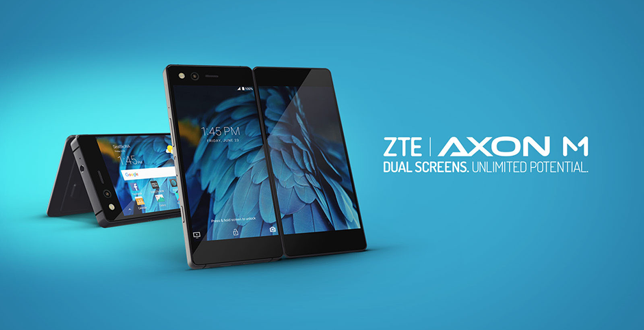
Product: ZTE Axon M Smartphone
My Role: UX Design / Interaction Design
Users: Millions of AT&T subscribers nationwide
Platform: Android phone
Client: AT&T Experience Design Studio
Year: 2017
Image credits: Engadget, CNET, PhoneArena
Project Overview
ZTE came to us in early 2017 with a plan to launch a yet-to-be-named dual-screen foldable Android smartphone as a flagship device on AT&T’s nationwide network by the end of the year, but the software was still in its earlier stages and the hardware wasn’t finalized.
I was part of the 5-person team at the AT&T Experience Design Studio that worked closely with ZTE’s engineering team to improve the user experience of the revolutionary ZTE Axon M before its release.

CNET’s review of the ZTE Axon M showing its dual-screen capabilities and different phone modes
Framing the Problem
We were introducing a smartphone unlike any other on the market to address common limitations for users of traditional smartphones like a lack of true multitasking support, smaller screen sizes, an inability to support themselves for handsfree viewing or photography, and others.
Many of our greatest challenges came from investigating fundamental questions like "What happens when someone unfolds the device?", "What happens when the device first turns on?", and "How can we make multitasking as seamless as possible?".
Research and Testing
A harmonious relationship between hardware and software was crucial to the Axon M’s success, so we maintained a highly iterative, prototyping-heavy process to ensure that harmony was seen in the final product.
When we first started the project, there were only a few prototype devices in the world so we didn’t have consistent access to a test device. We did our initial designing and prototyping with either a side-by-side interactive prototype on a single tablet screen or, my favorite method, two phones duct-taped together with separate prototypes running on each phone.
Once we received a physical prototype, we tested the hardware in our NYC studio and held remote research studies on the west coast to learn from users’ first-time experiences with the unique device. Our testing led us to design four distinct phone modes for users to make the most of the Axon M’s dual-screen format.

From left to right: Dual Mode in portrait, Extended Mode, and Dual Mode in landscape. Image credit: CNET
Single Mode
It was still valuable for users to have the Axon M work with only one screen on, so we designed Single Mode for users who wanted to focus on only one app, maintain privacy during phone calls, use the phone with one hand, or save battery.
In early versions of the phone users could only switch from Single Mode to other modes by pressing a button in the Android navigation bar, but after testing we designed the phone to automatically launch into Dual Mode when users open the phone to use the second screen.

ZTE Axon M in Single Mode. Image credit: CNET
Dual Mode
Dual Mode allows for true, full-featured multitasking by giving users the ability to run a separate app on each screen. Some of the most popular use cases that arose in testing were looking at Google Calendar while writing an email in Gmail, posting on social media while watching a video, and looking something up on Wikipedia while reading an article.
Dual Mode didn’t originally retain the app on the second screen when switching back to Single Mode, so after testing we added the capability for the app on the closed screen to be retained in memory when switching back and forth between Single and Dual Modes.
Testing also highlighted the need for new interactions involving both screens. In response, we designed special gestures to support unmet needs like copying and pasting between apps, swapping apps from one screen to the other, and expanding one of the two apps into Extended Mode.
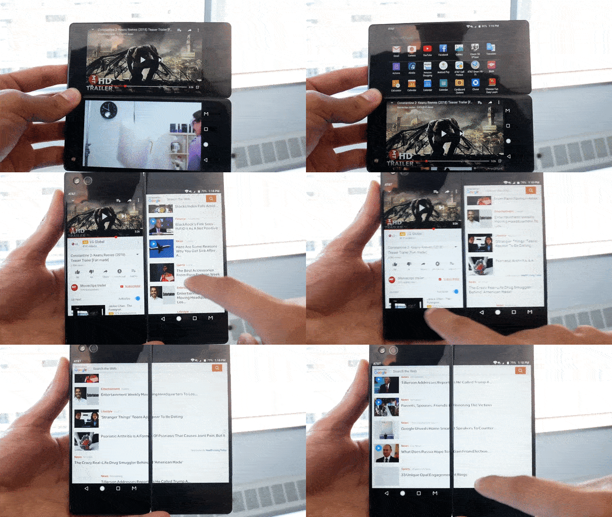
We designed gestures for moving an app from one screen to the other and expanding an app into Extended Mode while in Dual Mode. Image credit: PhoneArena
Extended Mode
Extended Mode allows apps to take full advantage of both screens and use them as a single large screen. Once in Extended Mode, users can have more space to feel immersed in playing games, reading articles, panning around maps, and an endless amount of other activities.
Most popular apps had little to no issues filling out the screen because many Android apps are already built to support a wide range of devices, but scaling sometimes caused usability issues in landscape orientation. With YouTube, full screen video was vertically-centered with the break for the Axon M’s hinge running directly through the middle of the video.
To remedy this, ZTE’s engineering team was able to optimize certain popular apps to have custom layouts that not only fixed these issues but helped users with pain points in the original apps. In the final version of Extended Mode in landscape orientation, YouTube features playing video on the top screen with info and comments below.
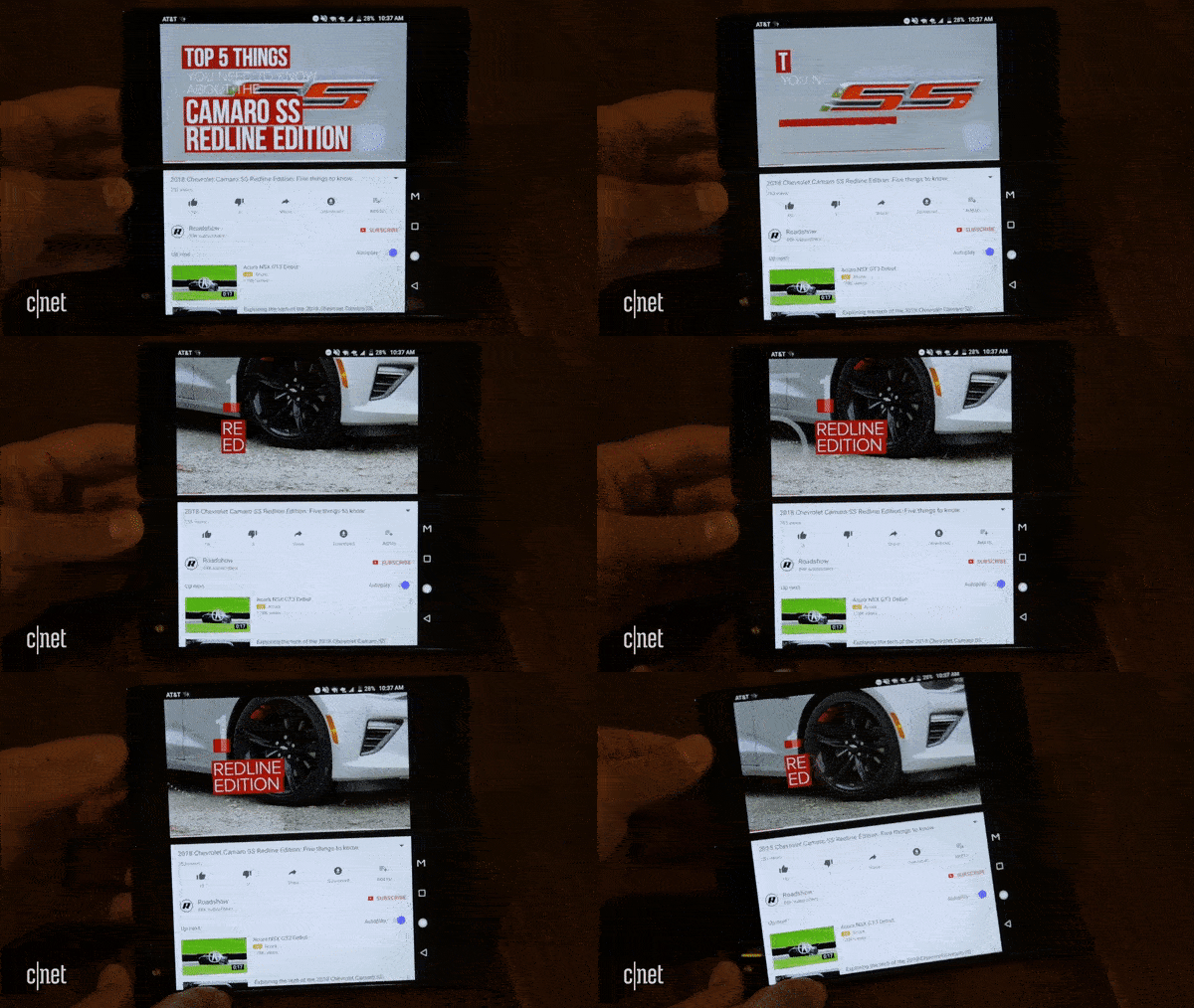
Optimized version of YouTube taking advantage of the dual-screen format in Extended Mode. Image credit: CNET

Popular apps are optimized to make the most of two screens in Extended Mode. Image credit: Engadget
Mirror Mode
ZTE’s early software had a mode with identical instances of an app next to each other fixed in portrait orientation, but never allowed the mirrored screens to switch to landscape.
In testing, the need arose for users to be able to watch videos, share social media posts, and play games with someone across from them. To give users this ability, we designed Mirror Mode to have identical screens in landscape orientation mirrored across the hinge so both screens are right side up when the phone is standing in a tent position.
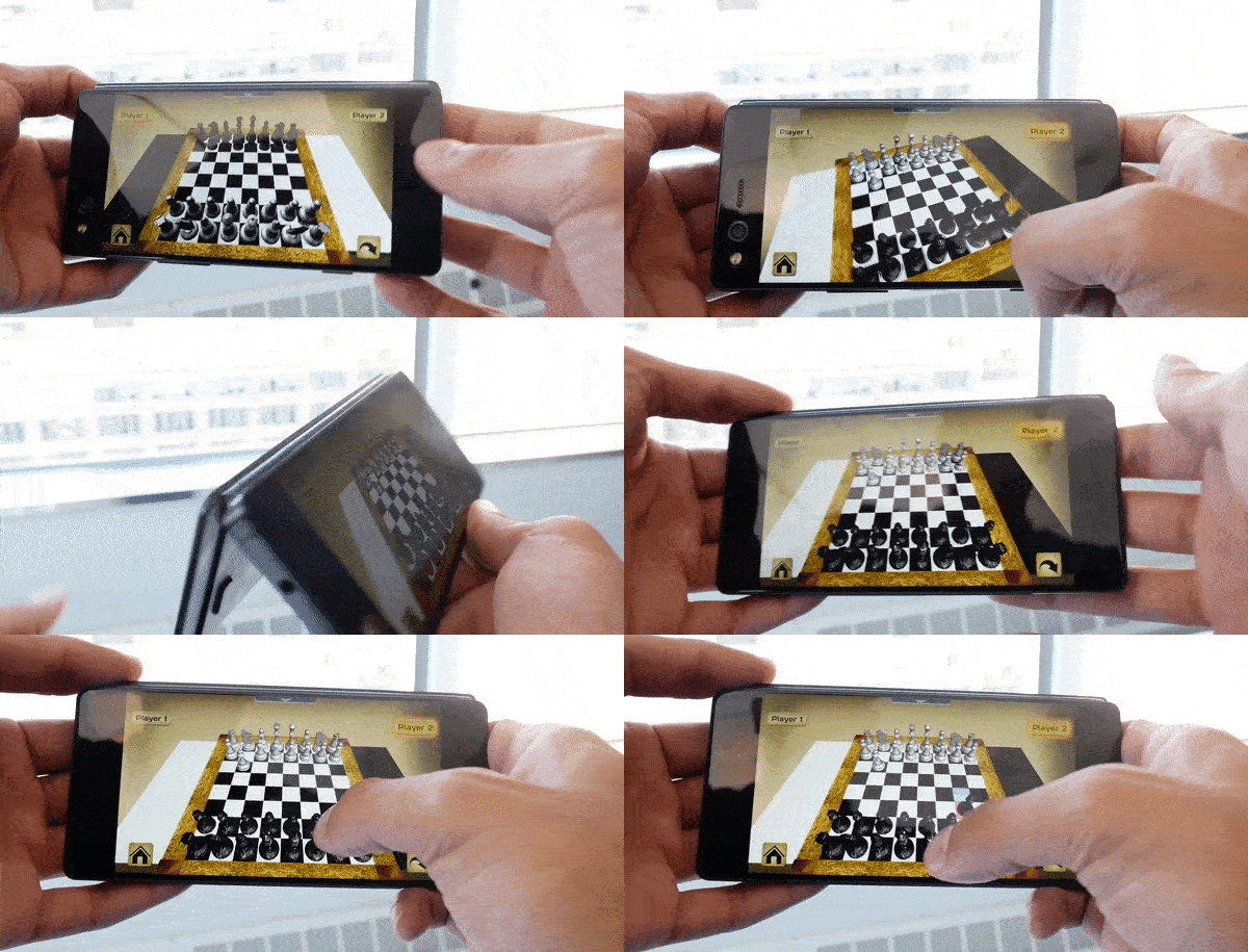
We designed Mirror Mode so users can play games and share content across while sitting across from each other. Image credit: PhoneArena
Closing Thoughts
AT&T released the device early and dissolved the project team in preparation to acquire Time Warner, so we unfortunately couldn’t launch the Axon M with our team’s UX and UI fully implemented as planned. This meant the Axon M was released before all of its apps and camera could be optimized, and our team couldn’t improve those areas of the product with updates after launch.
That aside, working on the Axon M was a blast. It was an exciting challenge for our team to design for a product that was the first in a new wave of folding smartphones, and to pioneer digital and physical interactions for both apps and the operating system itself.
“All three modes are useful in their own way. Dual, for instance, makes for efficient multitasking since you can drag and drop info between the screens, bring up a reference Wikipedia article while typing an email, or compose a tweet while watching a YouTube video.”
“Instead of stretching media to fit, the Axon M uses the extra space to show things like the comments section on YouTube videos. When Twitter is in Extend mode (and the phone is held horizontally), the bottom display shows the keyboard, so it doesn’t cut into the space above for you to compose your thoughts.”
“Both screens can display stuff independently of one another, which is ideal for multitasking. For instance, you can keep an email open on one side while penciling a calendar event on the other.”
“Firing up the selfie cam though is a breeze, and it’s a great phone to prop up for all those wide group shots.”
“If you see yourself getting a lot of use out of a dual display phone, the Axon M isn’t just your only choice but a pretty solid choice overall.”

