Inked Voices
Product: Inked Voices
My Role: UX Design / UX Research / Project Management
Users: A global community of passionate writers
Platform: Responsive web
Client: Inked Voices
Year: 2015
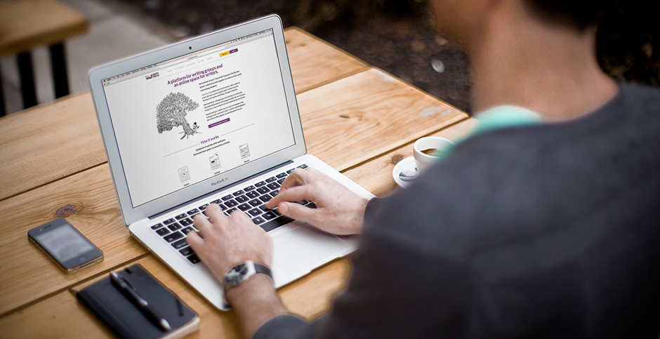
Link: Inked Voices website
Project Overview
Inked Voices is an online community for professional writers, amateur writers, teachers, and students to better their craft through video webinars, small critique groups, online forums, and other outlets. I served as UX Designer and Project Manager on a team of three.
Framing the Problem
The Inked Voices website was receiving a good amount of traffic, but new visitors weren’t signing up to use the platform. The Inked Voices team wanted to find out why, and needed help improving the user experience of their nonmember pages to boost sign-ups from new users.
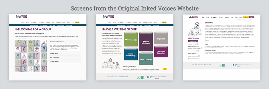
The old Inked Voices website had inconsistent navigation, cluttered page elements, and confusing imagery.
Competitive Research & Heuristic Evaluation
To educate ourselves about online offerings for writers, we compared Inked Voices with 11 similar products. We then used Jakob Nielsen’s 10 Usability Heuristics to further evaluate Inked Voices and two of its closest competitors. Our feature analysis and heuristic evaluation revealed how Inked Voices had a robust list of features, but there was plenty of room to improve its user experience:
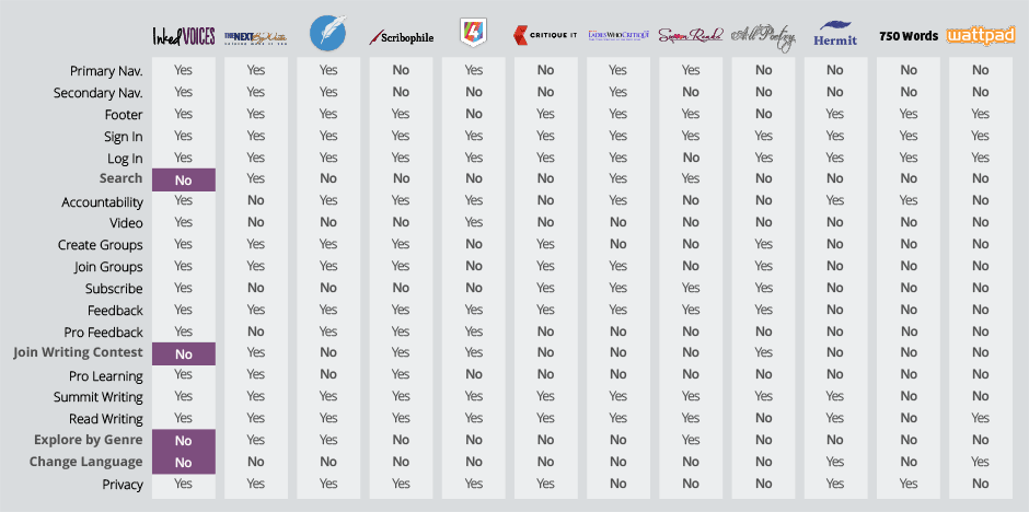
Inked Voices already had most of the top features that its competitors did.
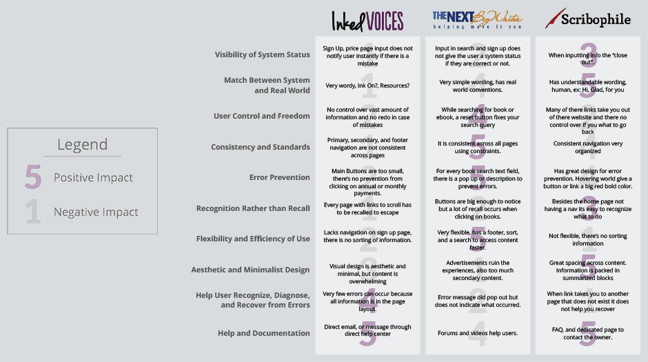
Our Heuristic Evaluation revealed that Inked Voices’ user experience was lacking compared to competitors.
User Research & Usability Testing
We then created a survey and interviewed 14 respondents in the U.S. and abroad who were ages 23 to 76, professional and amateur writers, professors, students, and non-writers. Each interviewee completed an in-depth questionnaire and usability test of the original Inked Voices website:
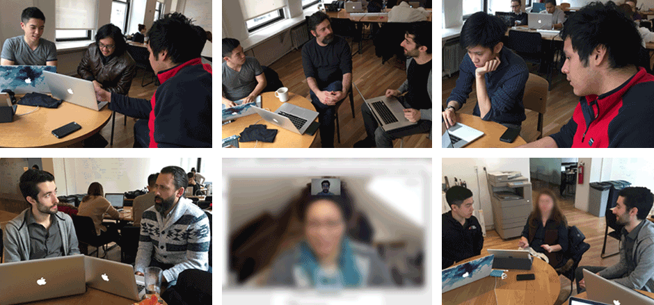
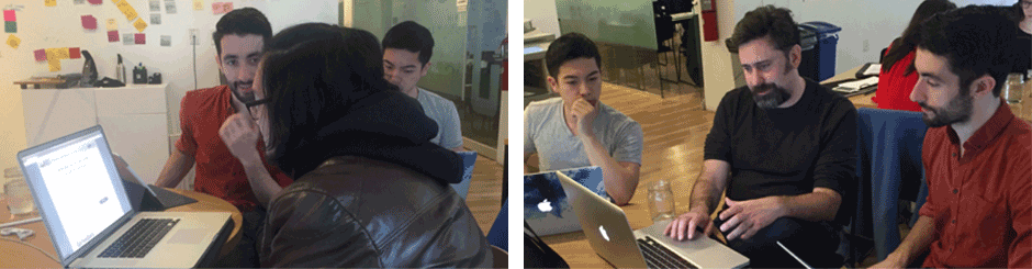
We conducted user interviews and usability tests both in-person and remotely.
Information Architecture
Inked Voices expanded its offerings since it first launched in 2014, and added additional nonmember pages for each new feature. Each of these new pages used a different top navigation bar, and our usability testing revealed that users were confused by the inconsistent navigation.
We wanted to define an information architecture that allowed users to intuitively find content and complete tasks, so we build digital card sorting exercises in which interviewees organized cards labeled with website content in ways they found most logical.
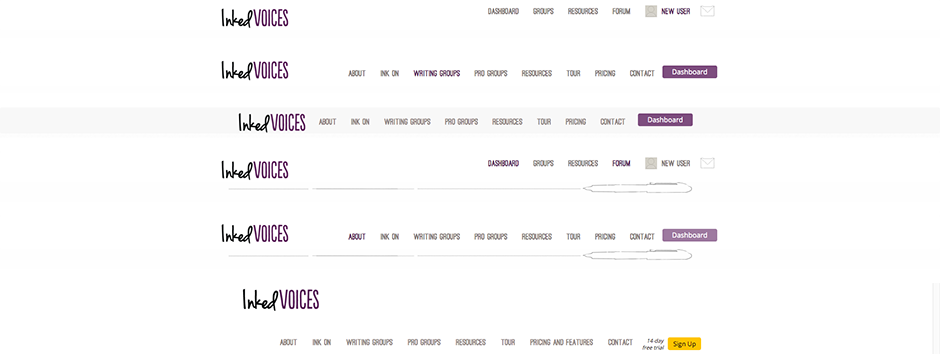
The existing Inked Voices website had inconsistent navigation bars across almost all of its nonmember pages.
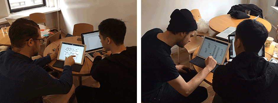
We led interviewees through digital card sorting exercises to collect feedback on and improve the information architecture of the Inked Voices website.
Affinity Mapping
We then created an affinity map using commonalities from our interviews, card sorting, and usability tests. Key findings from our research included how the majority felt the home page was overwhelming, important information wasn’t readily available, and knowing the skill levels of other community members was essential:
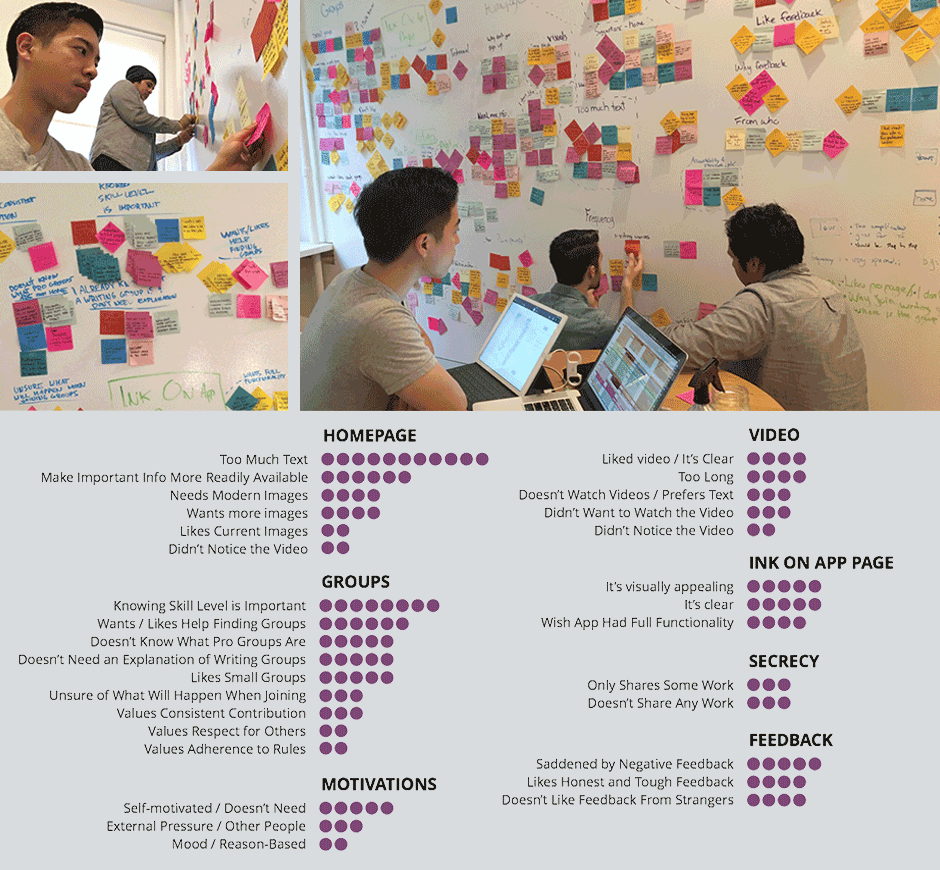
Our affinity mapping exposed patterns from our interviews and highlighted the most common unmet user needs.
Personas
We used findings from the affinity diagram to create three user personas. The personas had unique background stories, needs, pain points, and resulting ways we could help them. Our overall goal was to increase sign-ups, so we focused on our new user persona:
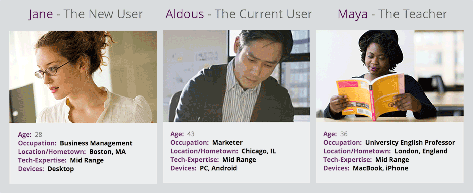
Building personas helped us clearly communicate the needs of different groups of Inked Voices users to stakeholders.
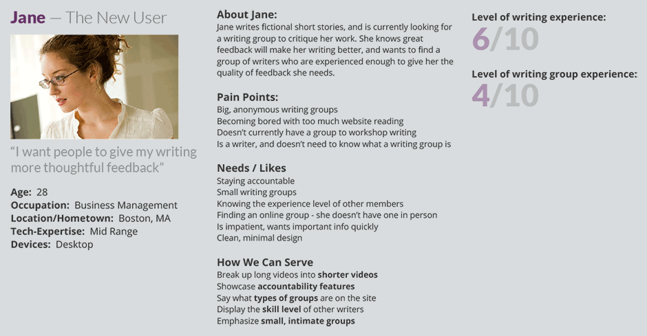
We used our new user persona to prioritize how we could best serve new users.
Ideation & Prototyping
Using our research, we developed user flows and sketched a wide range of designs that we later refined into digital wireframes. We then made interactive prototypes and conducted usability tests with seven people—both previous interviewees and new testers—which illuminated opportunities to iterate even further.
We refined the designs until users responded positively to what were formerly pain points, and presented our work to stakeholders at Inked Voices.
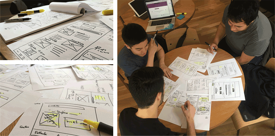
Before we started making digital wireframes, we hand sketched as a team to quickly generate and refine ideas.
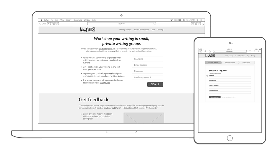
We built wireframe prototypes to get feedback on designs.
Conducting additional rounds of user testing helped us verify that our designs were meeting user needs.
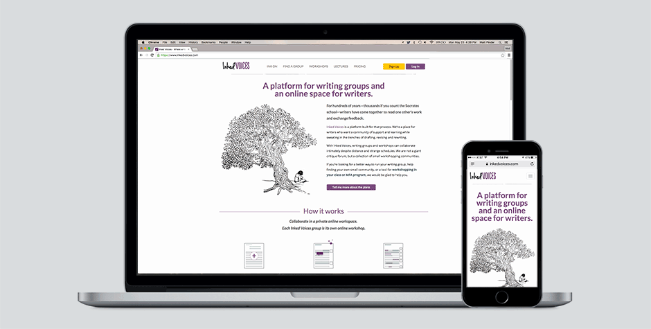
The redesigned website was streamlined to help new visitors quickly understand the value of using Inked Voices, and gave them easy, flexible ways to sign up.
Closing Thoughts
Redesigning the user experience of Inked Voices was an exciting project that made a real impact with a devoted online community. We were able to see during our usability studies that testers found the sign-up process to be much clearer, and after the redesign launched people wrote in about how the website was intuitive and easy to navigate.
Because we only worked with Inked Voices before the launch, we never learned if the positive reaction to the sign-up process during testing translated over to the launched website. It would have been great to have those metrics to see if the redesign was equally successful post-launch.

Brooke McIntyre
Founder of Inked Voices
“Matt was a UX designer and project manager for the engagement. Matt kept me informed throughout the project and made sure my feedback was incorporated into ongoing iterations of the work. I always felt like I was in good hands. Matt was also in charge of interviewing users for the project and doing usability testing with them. We had very good participation from users and I am sure part of it was due to Matt’s professionalism and organizational skills. Matt also brought his design eye to the project, contributing to the wireframing and mockup deliverables as well. I’m very pleased to have worked with Matt and the rest of the team.”
AT&T TV
ZTE Axon M

DIRECTV Remote App
Wine ’n Dine

Inked Voices