AT&T TV
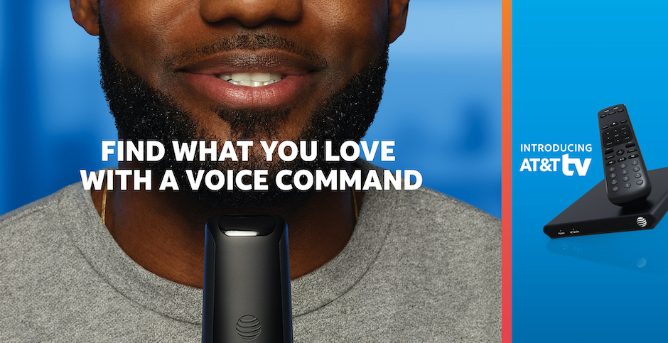
Product: AT&T TV
My Role: UX Design / UI Design / Motion Design
Users: Millions of AT&T TV subscribers nationwide
Platform: Apple TV, Android TV, Roku, Amazon Fire TV, Samsung Tizen
Client: AT&T Experience Design Studio
Year: 2017–2020
Links: Apple App Store, Google Play, Roku Channel Store
Project Overview
During my 3 years at the AT&T Experience Design Studio, my talented team and I launched the AT&T TV platform across mobile phones, tablets, streaming devices, TVs, and more. We conducted research studies, ran design sprints, collaborated closely with in-house and globally distributed development teams, and did innovative design work to define the future of TV.
Framing the Problem
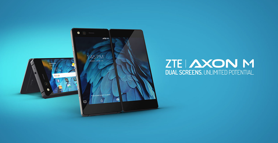
AT&T had recently acquired DIRECTV, which was an industry leader in live TV but still known for satellite during a streaming era. We wanted to design a product that satisfied our subscribers’ needs that weren’t met by AT&T and DIRECTV’s existing offerings.
Our mission for AT&T TV was to unify AT&T and DIRECTV’s post-acquisition product portfolios, create a dedicated full-featured streaming device to replace satellite receivers, and build a cross-platform video service for people to watch live and on-demand TV anywhere at any time.
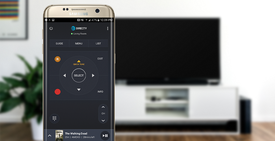
Because it was crucial to give subscribers multi-platform flexibility, we needed to design a product that worked on mobile phones, tablets, streaming devices, and TVs. This meant having a consistent design language and seamless experience across iOS, tvOS, Android, Android TV, Samsung Tizen, Roku, and other OSes.
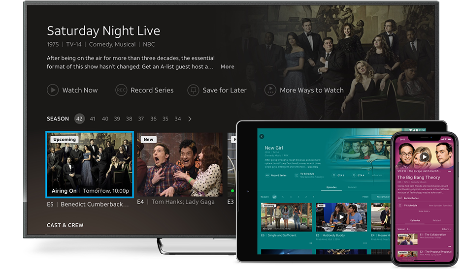
We designed AT&T TV to be a seamless experience across all devices.
My Contributions
I was responsible for the UI, UX, and often both on features that helped millions of users enjoy our vast catalog of live and on-demand content, log in and adjust their privacy settings, and configure their hardware across phones, tablets, TVs, and streaming devices. I jumped between UX documentation, UI documentation, research studies, working closely with our development team, illustration, animation, and more.
I worked remotely for the whole duration of this project, and played a primary role in establishing remote working best practices for our entire 50-person design team. All of the UX and UI shown below is from parts of AT&T TV that I worked on personally.
Physical & Digital
I always enjoy designing at the intersection of hardware and software, and worked closely with our hardware development and industrial design teams on many projects like onboarding for setting up the AT&T TV streaming box at home, button interactions for physical remotes, Bluetooth pairing, tutorials walking users through programming remotes to control TVs and speaker systems, and more.
One of the main design choices that set our platform apart from competitors is how users launch straight to video when starting the experience. This video remains the bottommost layer in main menus, which helped users in our research sessions easily understand that they can navigate back to what they are watching at any time.
Our deep research and user testing with existing TV products led us to pioneer solutions for longtime usability problems like difficulty programming remotes to work with TVs, speaker systems, and other devices. We designed AT&T TV to feel like "it just works," and it was the first product in its category to automatically program remotes to control TVs and speaker systems in the background right when they are connected.
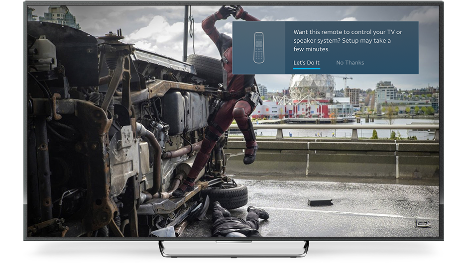
Notification that appears when automatic remote programming fails, such as with older infrared-only TVs from small manufacturers. Over 80% of users will never see this notification or the screens below due to automatic remote programming. I worked on the UI for the entire remote programming process.
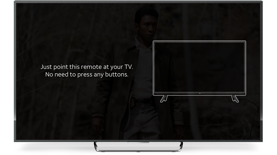
We eliminated the need for users to look up TV codes when they did need to manually program their remotes for a TV, which was a major pain point from our research on traditional remote programming. I did the illustration for the TV and worked on the UI for the entire remote programming process.
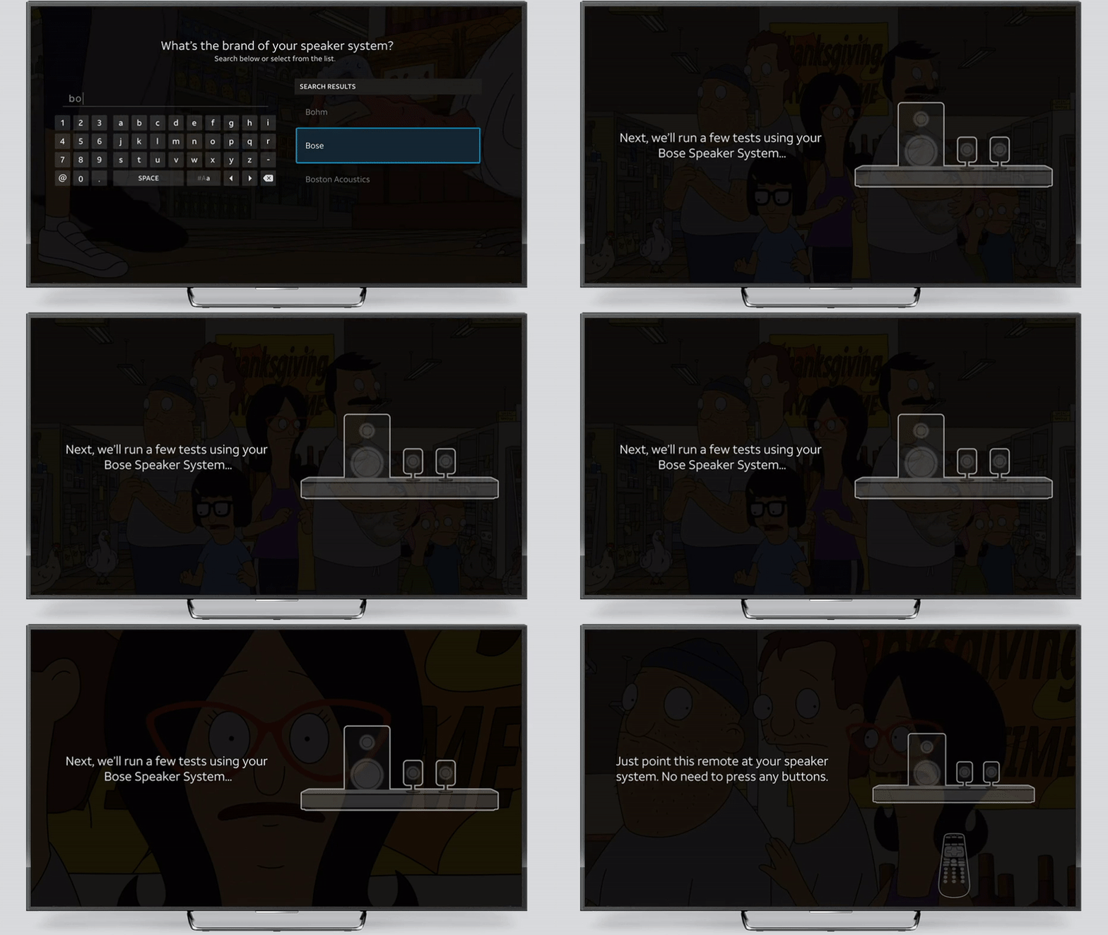
We combined plain language, illustration, and automated testing to make programming the remote to control devices unsupported by automatic programming simpler than ever. I did the illustration for the speaker system and worked on the UI for the entire remote programming process.
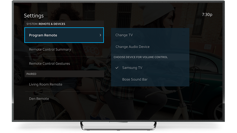
Remote and Devices section of AT&T TV Settings. The right panel is a preview of the menu that would be seen if the item on the left is selected. I worked on the UI for this screen and the entire remote programming process.
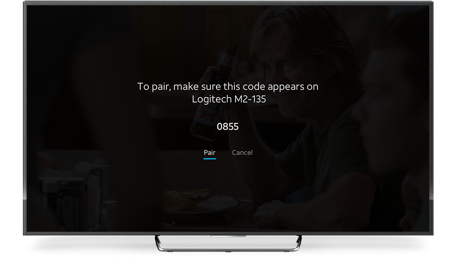
We designed Bluetooth pairing to be as quick as possible so users could easily connect alternate input devices and get right back to watching video. I worked on the UI for the Bluetooth pairing process.
Accessibility
I always keep accessibility at the center of my work, and advocated for accessibility and inclusive practices across our design organization. I made sure to test our designs to meet and exceed Apple accessibility guidelines, Material Design accessibility guidelines, and Web Content Accessibility Guidelines (WCAG) for font sizes, contrast, language level, text density, focus states, and more.
We adopted WCAG standards as minimums during my time on the team, and in many cases set WCAG Level AAA conformance as a requirement for our platform. We also simplified the process for pairing devices for alternate input control. These considerations were essential given the diversity of our millions of subscribers.
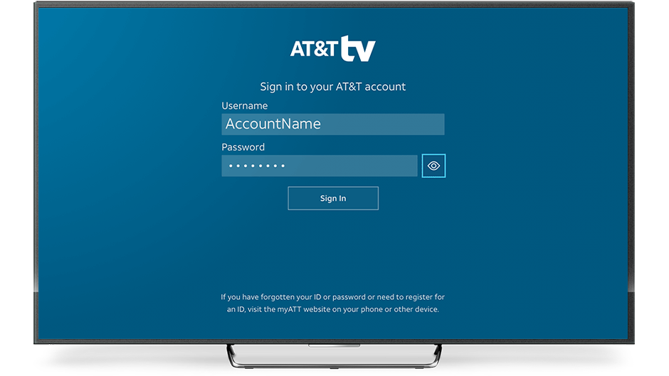
Main log-in screen for AT&T TV. I worked on the UI and UX for this feature.
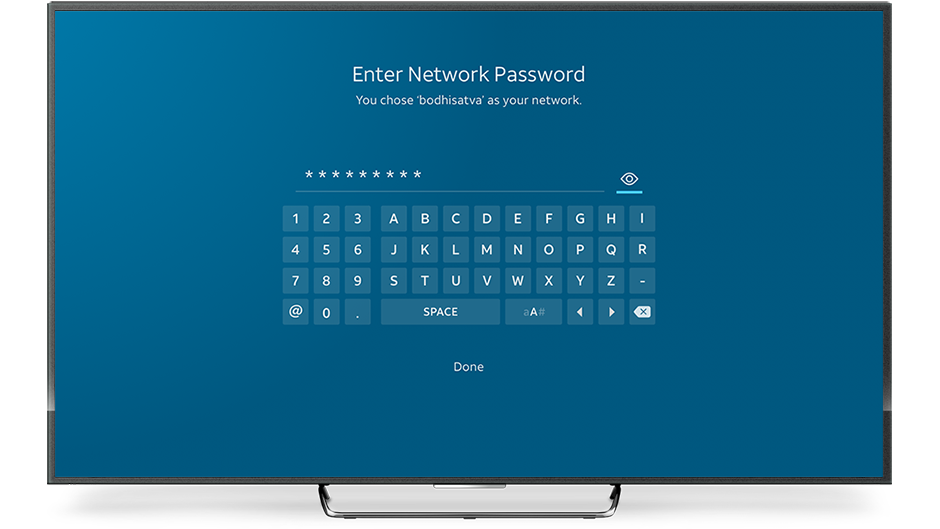
Enter network password screen for AT&T TV. I worked on the UI and UX for this feature.
Privacy & Security
Privacy and security for our millions of subscribers were of core importance to me and my team. We made sure to provide extensive tools to make them feel safe, including account and password management and parental controls.
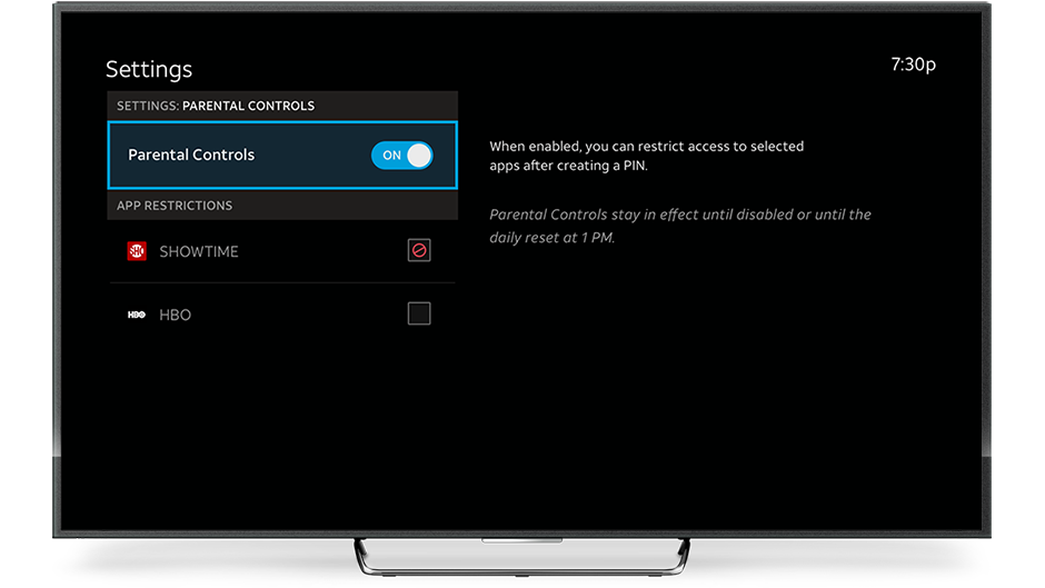
Parental Controls in Settings for the hospitality version of AT&T TV. I worked on the UI and UX for this feature.
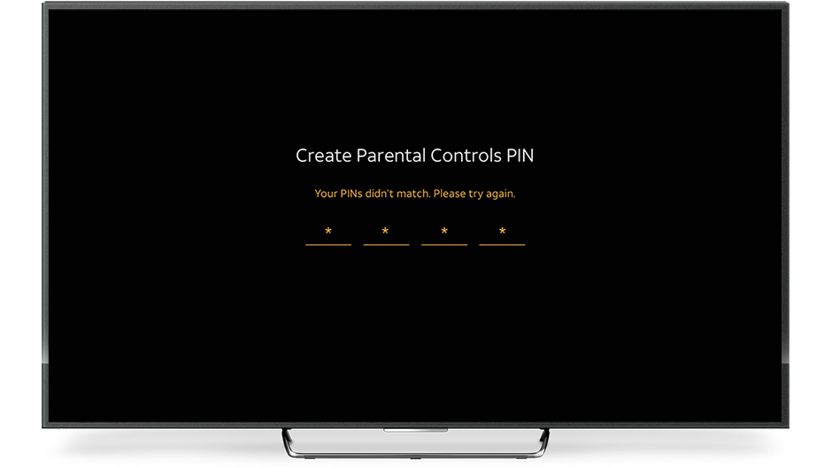
Error state for PINs not matching in Parental Controls on the hospitality version of AT&T TV. I worked on the UI and UX for this feature.
Closing Thoughts
Being a part of the team that brought AT&T TV to life was the best kind of challenge. I worked closely with design and development teams all over the world on a product that spanned across a wide variety of device types and OSes for millions of subscribers with a range of different locations, languages, connection speeds, and other diverse needs.
I had the opportunity to design what TV will be like in the future, and created forward-thinking features that I’ll hopefully be able to share when they come out in another few years.
Neil McIver
Associate Director of User Experience while at AT&T
“I had the pleasure of collaborating on several projects with Matt during our time together at AT&T. He is a great human being first and foremost, a selfless individual who always had a great attitude. Not only did Matt show initiative on UI/UX projects, he also played a huge role in establishing remote working best practices for the team, pushing our product and team forward. Matt’s attention to detail, curiosity and eagerness made a huge impact on number of AT&T TV features. Any organization would be lucky to have him and I genuinely hope we get to collaborate again!”
Bobby Tan
Lead Product Designer while at AT&T
“Matt is the most humble guy I know. Having worked together for several years in the same team, I know Matt to be extremely talented, approachable and professional. I find it rare to work with someone who is always a few steps ahead of you, and Matt is just that person — always prepared at any given situation. He is also a hard worker, given that we both work in different time-zones (Matt in NYC, me in CA,) it has always been seamless, and oftentimes I take for granted that he actually puts in very late hours.
Matt is a strong advocate for inclusive design and accessibility, and has shown deep empathy during the design process. He certainly cares very much about all aspects of our team’s design thinking process including UX, UI, Motion and Research. He is always proactive, autonomous, often exceeding what’s expected from a delivery standpoint. Skill-wise, I also see Matt as a full-stack designer, being able to utilize a wide range of design tools with solid knowledge in product design. Everything Matt touches, turns into delightful work — he just makes things look easy and has always been a pleasure to work with. I miss working with Matt as he will be a true gift to any team he joins. I only wish him the very best.”


